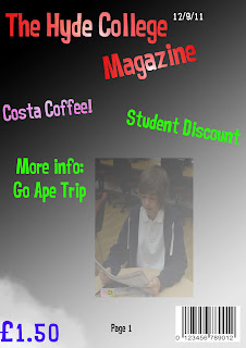
Are the font sizes correct?
I believe that the fonts sizes in which i have used are not all correct as the information in which i have provided under the masthead are too big and i believe that they should be really in a size 12 font, however the font size in which i have used for the masthead is appropriate as it is large and needs to stand out. The font sizes in which i have used on the contents page i believe to be appropriate as the title is large and the text is a font size 12 in which i believe to be appropriate.
Does it fit the three colour rule?
My cover fits the three colour rule as there are 3 colours in which i have used for the text, however the contents page only has 2 colours on it and i believe that i should have used more.
You are able to tell that both the contents page and the cover are from the same magazine as i have used the same font throughout and also the colours in which have been used on both the cover and the contents are similar, it also has a similar structure on both the front cover and the contents page.
The photos taken on both the cover and the contents are appropriate as on the cover i was told to get a medium close up and that is what the image is, the image is also in proportion and has not been stretched so that it fits, this is also applied to the contents as the images are not stretched and fit in with what the contents is about.
I do believe that there could be a few more stories on the contents page as there is not a lot that can be read and this will mean that the people in which read the magazine will not have a lot to read and also they will not be able to gather information in which they may want about the college however, i do believe that what has been written is appropriate as they are based on the college and not of topic this will mean that what the people read is correct and then they will know what is going on. The information in which i have provided on the cover is appropriate as it gives you an indication on what is going to be said on the contents page this is good as the people who take a quick glance at the cover will immediately be able to see what is going to be said on the contents page in more detail. I also believe that what is being said on the contents page will interest the reader as they may find that they are interested in what is going on.

The cover is a very clear simple design, all the text and images are big enough so can be seen easily which is important. the text and images used are appropriate because there all to do with college.
ReplyDeletethe only improvement i'd say is to add a mainheadline to the cover
I really like how you have set out your contents page by washing out the background and tilting the photo's. This makes it look really interesting and individual.
ReplyDeleteAn improvement could be to add a main story to catch the reader's attention more.
The college magazine stands out from the rest because of the vibrant colours that you have used.
ReplyDeleteAn improvement could be that you didn't provide information about 'Costa Coffee' on the contents page even though you put it as a main story on your cover page.