Dear Moderator
I hope you enjoyed looking through my blog, you will find my completed magazine underneath this message. Underneath my completed magazine is my evaluation and my research and planning starts in September.
Thanks
Levi
Thanks
Levi
Friday, 30 September 2011
Thursday, 29 September 2011
Research and Planning: Shot Type Research
Here is an example of some camera shots,i drew these shot types as i may use them in my music magazine
Research and Planning: College Magazine Evaluation

Are the font sizes correct?
I believe that the fonts sizes in which i have used are not all correct as the information in which i have provided under the masthead are too big and i believe that they should be really in a size 12 font, however the font size in which i have used for the masthead is appropriate as it is large and needs to stand out. The font sizes in which i have used on the contents page i believe to be appropriate as the title is large and the text is a font size 12 in which i believe to be appropriate.
Does it fit the three colour rule?
My cover fits the three colour rule as there are 3 colours in which i have used for the text, however the contents page only has 2 colours on it and i believe that i should have used more.
You are able to tell that both the contents page and the cover are from the same magazine as i have used the same font throughout and also the colours in which have been used on both the cover and the contents are similar, it also has a similar structure on both the front cover and the contents page.
The photos taken on both the cover and the contents are appropriate as on the cover i was told to get a medium close up and that is what the image is, the image is also in proportion and has not been stretched so that it fits, this is also applied to the contents as the images are not stretched and fit in with what the contents is about.
I do believe that there could be a few more stories on the contents page as there is not a lot that can be read and this will mean that the people in which read the magazine will not have a lot to read and also they will not be able to gather information in which they may want about the college however, i do believe that what has been written is appropriate as they are based on the college and not of topic this will mean that what the people read is correct and then they will know what is going on. The information in which i have provided on the cover is appropriate as it gives you an indication on what is going to be said on the contents page this is good as the people who take a quick glance at the cover will immediately be able to see what is going to be said on the contents page in more detail. I also believe that what is being said on the contents page will interest the reader as they may find that they are interested in what is going on.
Thursday, 22 September 2011
Wednesday, 21 September 2011
Monday, 19 September 2011
Research and planning: Fonts activity/mastheads

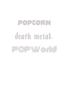
Here i was playing with fonts and i was matching them to a certain genre, in this case i had to search for fonts on the basis of Popworld, death metal and popcorn.
Research and planning: College magazine analysis
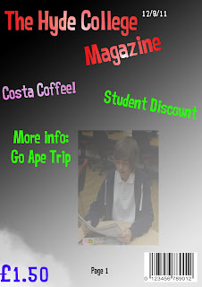
This is the magazine in which we looked at in order to help us in the planning of our own magazine. We knew that this was a college magazine for a few reasons not just for the reason it had a masthead saying 'College' we knew this because it had some of the following features, a masthead, issue number, date , barcode/price and the main picture.
We also knew that this was a college magazine as the information provided inside was all college based and the person on the front is of a student in which is holding some books.
Research and planning: Photoshop challenge
Here i have done the photoshop challenge in which i had to make an A4 sized document on Photoshop and then add text to the centre of the page 'Century Gothic Size 24' the text saying ' AS Media Studies'. Then i had to put a border around the A4 document of any kind, I then had to change the colour of my background to a colour of my choosing in this case blue as it allowed the red text to be visable. I also had to add a picture of a woman to the document underneath the text in the centre of the page and then change her hair colour.
Research and planning: Photoshop skin tutorial
Here i have edited the way this girl looks, i have added some makeup to her and also taken somethings away as i used the spot checker tool and took away the spots in which she had.
Research and Planning: CD cover Photoshop tutorial
What I did:
- I used magic wand
- I used the magnetic lasso tool in order to select the CD
- I also changed the colour of the images from the previous colours in which they were
- I then changed the background by using a filter to add more of an effect to it
- I added text to it and also changed the font and colour from what it previously was
Subscribe to:
Posts (Atom)


